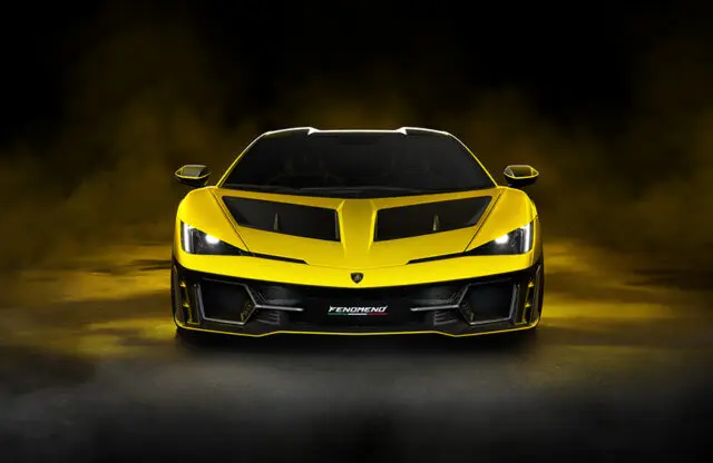
It was never going to go well. Jaguar released its new logo and brand imagery in a flurry of imagery that can only look ridiculous to most of its followers in the UK, who largely associate the brand with Le Mans, Inspector Morse, wood and leather interiors, and powerful internal-combustion engines.
The backlash was teeth-grindingly negative, and was called out as ‘woke’ by right-leaning mainstream media and even breakfast TV. Everyone seemed to suddenly be a Jaguar expert, and all were apparently deeply horrified.
I can confirm that the first hour of the press presentation was also packed with the same imagery and a lot of overly sincere talk of ‘Exuberant Modernism’ and ‘Copy Nothing‘ – the latter a take on founder Sir William Lyons’ belief that “A Jaguar should be a copy of nothing”.
The over-egged point was that Jaguar wants to be unique and original again, with striking designs and bold colours, rather than trying for the mass market, in which it wasn’t able to compete even when up against BMW and Audi, let alone in the future when Chinese cars will undercut them all.
After an hour or so of this, the concept car was finally revealed – and the marketing nonsense was mostly forgotten. The response seemed largely positive.
The concept car is said to indicate the design language of the production models to follow, the first of which will be a four-door GT. It will be revealed on December 2 at Miami Art Week, where the marketing will feel far less inappropriate.
Now, Magneto magazine is under embargo on the concept car until the Miami launch, but I think I can get away with saying that it’s like no other Jaguar you’ve seen before; that’s it’s brave, bold and striking; that it’s the absolute opposite of the bland XE executive saloon that signified the end of the existing company in many ways.
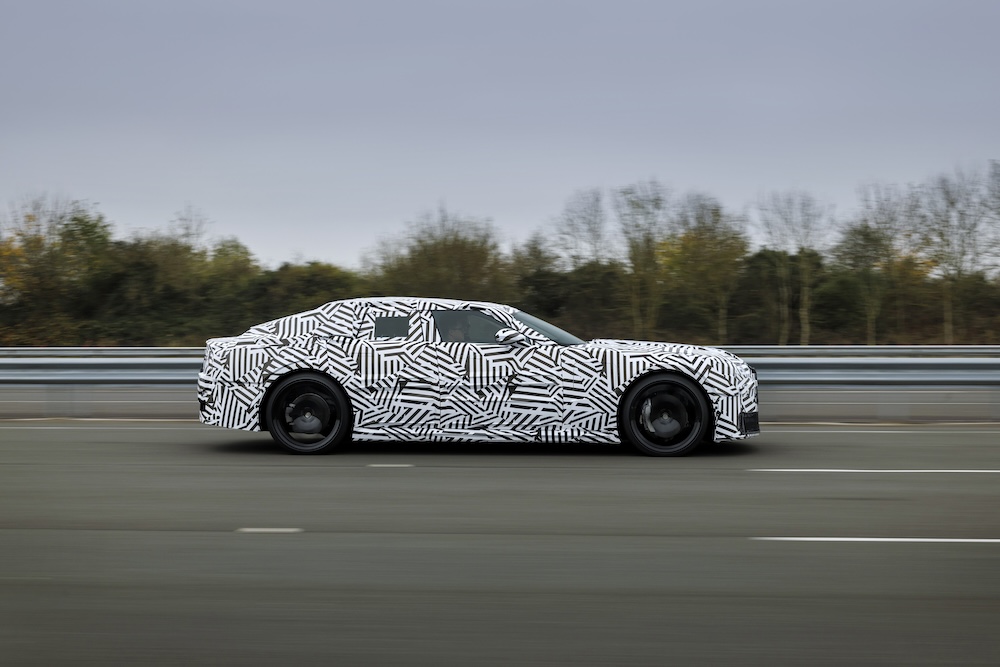
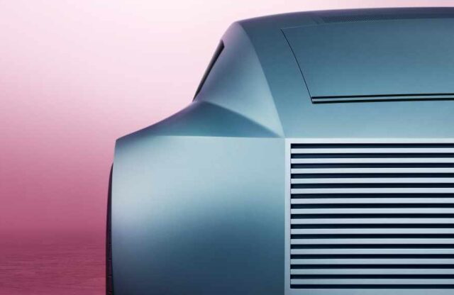
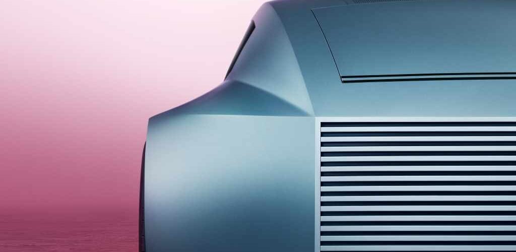
The image you see at the top of your screen is of the concept car’s windowless rear, while the spy shots here show the first shots of the heavily camouflaged four-door GT.
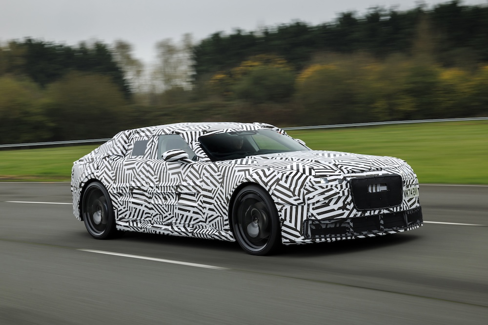
The negative comments that followed the reveal of the logo were unanimous in the opinion that this new-look Jaguar is dead. Actually, current Jaguar is more or less dead anyway – and not because production has now stopped. This is pure kill or cure, reinventing Jaguar for a brave new world that inevitably will feature EV propulsion.
Where the negative comments do chime is on the logo. The mix of upper and lower case, said by the design team to provide ‘balance and symmetry’, looks modern but not premium, and the same can be said of the ‘jr’ device – although they look better on the car than they do shown in isolation here.
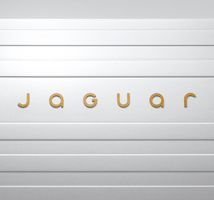
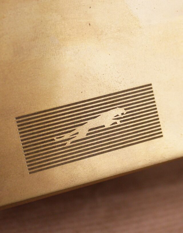
The new Leaper is shown here over a series of straight lines, referred to as the Strikethrough

There was outrage in some of the media that the ‘Growler’ badge, depicting the face of a jaguar big cat, has been killed off, but honestly, does that type of badging fit with any car brand any more? Surely not. It’s looked dated for years.
The famous Leaper has been retained, however, as is only right. The new Leaper is shown here over a series on straight lines, referred to as the ‘Strikethrough’, which you’ll see from the rear corner of the car is a design treatment used on the bodywork, too.
So, the verdict? Ignore the cringeworthy-to-our-tastes marketing and imagery, accept that you need to see the car before making further judgements, and hope that Jaguar can pull this off when it re-emerges as an all EV-manufacturer in 2026.
